

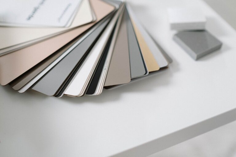
Creating a calm and relaxing environment in your home often starts with the colors you choose for your walls and décor. Calm colors have the power to soothe your mind, reduce stress, and make your living space feel more welcoming. Whether you’re repainting a single room or decorating an entire house, choosing the right colors can make all the difference.
In this article, we’ll explore practical tips for selecting calm colors that will help you achieve a serene atmosphere in your home.
Why Choose Calm Colors?
Before diving into the tips, it’s helpful to understand why calm colors matter. Unlike bold or vibrant colors, calm hues are soft and muted, which can help:
– Create a peaceful environment
– Enhance relaxation and sleep quality
– Make spaces feel light and airy
– Complement a wide range of furnishings and styles
Common calm colors include soft blues, gentle greens, muted grays, and warm neutrals. These shades often remind us of nature, like the sky, water, or earth, which naturally soothes our senses.
Tips for Selecting Calm Colors
1. Consider the Room’s Purpose
Different rooms serve different purposes, and the color should support the activities you do there:
– Bedrooms: Opt for soft blues, lavenders, or gentle greens to promote rest and relaxation.
– Living Rooms: Warm neutrals and soft grays can provide a cozy yet calm setting.
– Bathrooms: Light greens and pale blues evoke freshness and cleanliness.
– Home Office: Muted blues or soft beige can improve focus without feeling sterile.
2. Look for Soft, Muted Tones
When choosing calm colors, avoid overly bright or intense shades. Instead, focus on:
– Pastels like pale pink, light gray, or beige
– Desaturated versions of bold colors (e.g., dusty blue instead of bright blue)
– Earthy tones such as taupe, sage, or clay
These softer tones help create a tranquil mood without distracting from other design elements.
3. Test Samples in Different Lighting
Colors can look very different depending on the lighting—natural daylight, artificial light, or the time of day. Before committing:
– Paint small test patches on your walls.
– Observe how the color changes throughout the day.
– Consider how room size and window placement affect the color’s appearance.
Testing helps ensure you pick a color that stays calm and pleasant in all conditions.
4. Use a Color Palette for Balance
Pairing calm colors effectively is key to a harmonious home. To create balance:
– Choose a primary calm color for the largest surfaces (walls, floors).
– Add complementary calm tones for accents and furniture.
– Include neutral shades like white, cream, or soft gray to break up large areas and add contrast.
Using a cohesive palette keeps your space unified and soothing.
5. Incorporate Natural Materials and Textures
Calm colors pair beautifully with natural textures such as wood, linen, and stone. These elements add warmth and interest without overwhelming your senses. Consider:
– Wooden furniture or flooring in light or medium tones
– Linen curtains or cushions in matching calm hues
– Stone or ceramic accessories that highlight earth tones
Natural materials help reinforce the peaceful vibe associated with calm colors.
6. Avoid Over-Cluttering Your Space
Even the most calming colors can feel stressful if the room is cluttered or overcrowded. To maintain tranquility:
– Keep décor simple and purposeful.
– Use storage solutions to minimize visible clutter.
– Choose furniture with clean lines and soft finishes.
A tidy, well-organized room lets calm colors shine and contributes to a relaxing atmosphere.
7. Use Color Psychology as a Guide
While personal preferences matter most, color psychology offers helpful insights:
– Blue: Often linked with feelings of calm and serenity.
– Green: Symbolizes nature and promotes balance.
– Gray: Neutral and grounding but best when paired with warmer tones.
– Beige and Cream: Warm and inviting, great for creating a soft backdrop.
Keep these associations in mind, but remember that how a color makes you feel is unique.
Final Thoughts
Selecting calm colors for your home is a wonderful way to create a peaceful retreat where you can relax and recharge. By considering your room’s purpose, testing samples in different lights, using a balanced color palette, and incorporating natural materials, you can build a serene environment that reflects your style and supports your well-being.
Take your time exploring calm shades, and don’t be afraid to experiment. With thoughtful choices, your home can become a sanctuary of calm and comfort.